Tuesday, March 20, 2018

Monday, August 21, 2017

MMPR (Malaysia Association for Mindfulness Practice and Research)

MMPR (Malaysia Association for Mindfulness Practice and Research) is the only organisation in Malaysia which offers meditative programmes to all age groups. 3nity developed its brand identity to reflect the core of the MMPR.

The logotype is self-explanatory with the organisation’s initials, and the two parallel lines represent the eyes of a person. The main logotype is the “still” expression of someone in mindful meditation. The different combinations of parallel lines indicate the different emotions during meditation. The logotype is sometimes placed together with a peaceful image of the horizon to convey the 
essence of mindfulness.


Saturday, April 1, 2017

TRIBECA Real Estate Asset Management Sdn Bhd

TRIBECA Real Estate Asset Management Sdn Bhd (TRIBECA), is an innovative real estate advisory firm based in Malaysia. TRIBECA is more than just a property developer, it is also a marque that adds value to any property asset. Its strategies are founded upon years of experience and sound business acumen, with the aim to create lasting value in real estate investments for its partners, investors and clients. At the same time, its enduring collaborations with the world's leading names in architecture, interior design, landscaping, civil engineering and construction ensure that all projects exhibit the highest quality.

3nity had a hand in giving a more polished look to the firm’s corporate identity to reflect a touch of understated elegance. The same look was further developed for its visually conceptual corporate website, and our client was very pleased with the results.


Friday, January 20, 2017

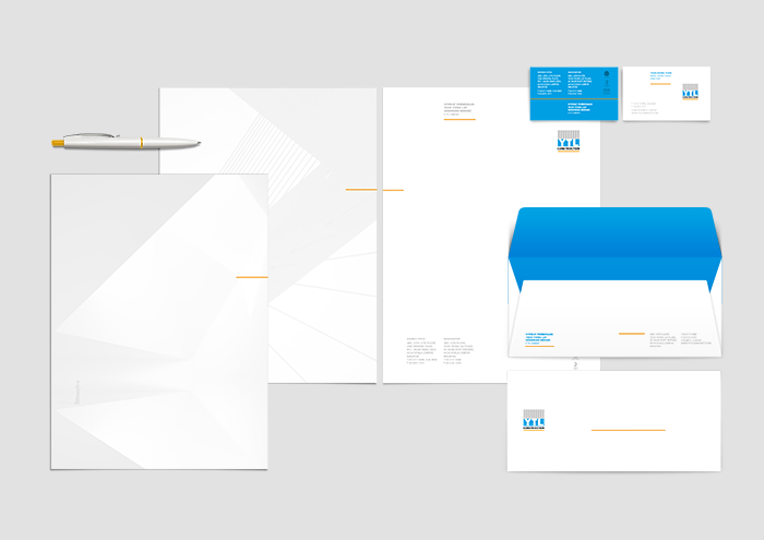
YTL Construction

YTL Construction is the foundation on which the YTL Group (since 1955), an integrated infrastructure group with a global presence in 33 countries, was built. Today, YTL Construction is a full-spectrum construction group, offering services from concept and design through to building and fit out. 

3nity has revitalised the visual identity of YTL Construction to reflect a more creative, dynamic and innovative image to its current workforce. This new identity is then reflected across the company’s collaterals, the first being its SPYTL website and employee handbook. At the same time, whole floors of the company's office tower have been given a makeover to conform to the new image.


Friday, March 25, 2016

The Kuala Lumpur Journal

3nity was approached to create a brand identity for a boutique hotel in KL city centre. Designed with an inviting vibe where nostalgia meets industrial chic, The Kuala Lumpur Journal is centrally located in the city’s main shopping and entertainment district of Changkat Bukit Bintang – the hub of KL nightlife with its thriving bar culture and KL’s foodie mecca, Jalan Alor. Our role is to build a brand that resonates with the target audience and compliments their travel motivations. Centered around its guests in connection with the hotel’s surroundings and its culture, The Kuala Lumpur Journal is a hotel which provides premium comfort and flexible amenities with an authentic, engaging touch of local culture. This authentic space offers unique ‘curated experiences’ that allow guests to go on a discovery journey which is personally enriching and inspiring – from exploring the local neighbourhood to a chance meeting with a co-working space tenant.


Airia

3nity was asked to create a new brand identity for a local bottled mineral water company.

Airia is a combination of the word air (water) and ria (happy) when air is spelled backwards in Bahasa Malaysia. Traits that the brand name invokes when one consumes water.

Inspiration for Airia stems from the minerals contained in the water which is sourced from the mountain which is believed to benefit the local inhabitants (Human & Animals) as a result of the positivity and longevity of the surroundings and the inhabitants.

The brand identity design is a green watercolour circle which represents a human face whilst the handwritten ‘Airia’ signifies the facial features to the sight of a happy smiling face. The bottle silhouette derives from the shape of bamboo which grown within water source. 

Together with the trademark and bottle the brand highlights natural joy and happiness.


Southern Marina


Next home