Monday, February 15, 2010

E&O - Idamansara

One of E&O Property’s projects in Kuala Lumpur, Idamansara is an enclave comprising 82 units of semi-detached and 9 units of detached homes located in the premier residential address of Damansara Heights.

3Di, a division of 3nity, was appointed to design Idamansara’s handover kit.


Malaysia Wetlands Foundation

Paya Indah is a wetlands reserve and ecotourism area. Our design symbolizes the happy yet delicate equilibrium of the three elements here – Water, Land and Sky. What makes the wetlands special is that the inhabitants of each element support the other in harmonious symbiosis, a phenomenon unique to the wetlands as few geological areas support such a diverse range of wildlife.


Arah Pendidikan

Arah Pendidikan is a local publisher appointed by the Government to publish books for the primary to tertiary levels of education in Malaysia. A new player in the publishing industry, it focuses on promoting the ‘new syllabus’ whereby three subjects — English, Mathematic and Science — are intertwined for effective learning. 3nity was appointed to create and implement its brand identity.


YTL - Starhill

YTL Hotels & Properties Sdn Bhd (YTLHP) is a division of YTL Corporation that manages its accommodations and hospitality portfolio in Southeast Asia. The world-renowned Pangkor Laut Resort, Tanjong Jara Resort, Spa Village Pangkor Laut and Spa Village Tembok Bali are among the entities under the Luxury brand.

YTLHP had marketing materials that looked dated and did not reflect their hotels’ luxury status in the hospitality industry. The hotels under its wings were producing their own communications without a standard application of YTLHP’s identity. 3nity’s task was to revamp the marketing collaterals for the Luxury resorts and spas. We were also asked to set guidelines for the Resorts, Spa Village and YTLHP group identities.


YTL - Pangkor Laut Resort

YTL Hotels & Properties Sdn Bhd (YTLHP) is a division of YTL Corporation that manages its accommodations and hospitality portfolio in Southeast Asia. The world-renowned Pangkor Laut Resort, Tanjong Jara Resort, Spa Village Pangkor Laut and Spa Village Tembok Bali are among the entities under the Luxury brand.

YTLHP had marketing materials that looked dated and did not reflect their hotels’ luxury status in the hospitality industry. The hotels under its wings were producing their own communications without a standard application of YTLHP’s identity. 3nity’s task was to revamp the marketing collaterals for the Luxury resorts and spas. We were also asked to set guidelines for the Resorts, Spa Village and YTLHP group identities.


YTL - Spa Village

YTL Hotels & Properties Sdn Bhd (YTLHP) is a division of YTL Corporation that manages its accommodations and hospitality portfolio in Southeast Asia. The world-renowned Pangkor Laut Resort, Tanjong Jara Resort, Spa Village Pangkor Laut and Spa Village Tembok Bali are among the entities under the Luxury brand.

YTLHP had marketing materials that looked dated and did not reflect their hotels’ luxury status in the hospitality industry. The hotels under its wings were producing their own communications without a standard application of YTLHP’s identity. 3nity’s task was to revamp the marketing collaterals for the Luxury resorts and spas. We were also asked to set guidelines for the Resorts, Spa Village and YTLHP group identities.


Takeo Fine Paper

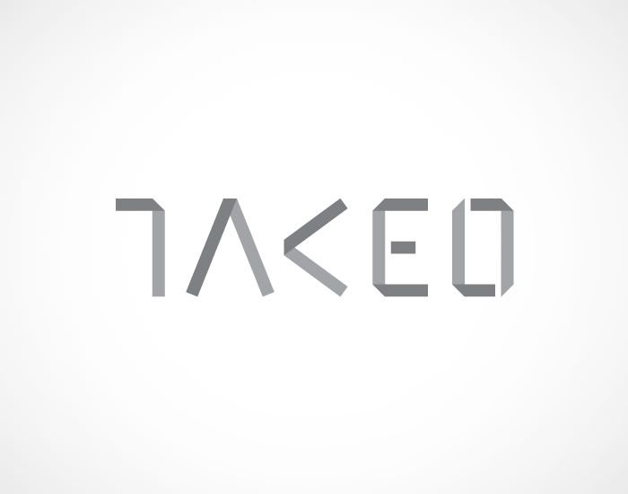
Fine Paper Takeo Malaysia is a subsidiary of Takeo Company Limited, a leading paper merchant in Japan. All Takeo subsidiaries are tasked with designing their own identity hence 3nity was approached by Fine Paper Takeo Malaysia to create their brand identity and paper swatches, which are their main communications and marketing tool.


Clear Fog

Clear Fog is an Ambient Communications company based in Frankfurt, Germany. It conceptualizes and brings to life unconventional and experimental showpieces – from installations and exhibitions to product designs – for a niche group of clients mostly from the music and arts industries. 3nity was approached to create a new identity for Clear Fog.

In view of Clear Fog’s unique and purist-like work, we knew the identity should be unconventional. The proposed identity is based on sound and light waves, two elements that are central in Ambient Communications. The identity comprises a logotype and an expandable pattern library derived from sound and light waves. Each pattern is assigned to a Clear Fog client and implemented across all communications pertaining to the client, from printed documents to emails.


Previous Next home